No, you dingus, They’re not fonts… unless they are. Idfk. Okay, fine… whatever works for you.
I’m going to be a pretentious dickhead and call them Typefaces… Why?
Well, a typeface is generally an old term for what we refer to these days as “Fonts”, the appearance of letters and the way in which they are either stamped onto paper (in the case of winga-dinga moving type) or displayed on a computer screen.
Fun fact, ever wonder why letters are referred to as “Upper” and “Lower” case? Well, back when typefaces were sold to us designers and typesetters as a box of literal keys to be put into a press, they used to come in a literal box of letters. Since the typesetter was more likely to use the letter in the case on the lower rack, they named the smaller letters the “Lower case” letters, and the Capitals the “Upper Case” letters.
There’s also a distinct different between a Printer and a Press. A Printer has two meanings. One, it’s the name of a person who makes prints (duh), and it’s also the name of a machine that applies ink to a substrate (Beit paper, plastic, fabric or your any other surface) directly, either through a screen (Screen printing) or by an oscillating head that from side to side that deposits ink to the substrate. The benefit of printing is that you have more control of the colours which you print to a substrate because either a computer controls the colour at the print head, or you as the printer can mix and choose the colour you want to print through that screen. It’s a slower process but yields much nicer results for photographs and the like.
A press on the other hand, literally uses a plate that dispenses ink by pressing the plate into the substrate. Presses are much faster at mass-producing printed documents but lack the colour fidelity that printing has, due to the fact that the ink is not mixed before it hits the page, it’s doled out in solid form and the level of colour is controlled by offsetting dots through a technique called “Offset Pressing” These days, the plates are produced using lithography, and these plates are produced electronically using graphic design tools, converters, and then made using high-precision lasers and the like. Pretty cool stuff.
Anyway, enough about me nerding out about printers, there’s lots of different typefaces and/or fonts out there and there’s a bunch of uses for each one. But, I’m just going to go through a select few and why I absolutely adore the ever-loving heck out of them… Honestly though, my typeface preferences are pretty boring, as I’m a function-centric designer.
DIN1451
NEIN, NEIN, ACHTUNG!
Yeah, this is pretty goddamn obvious isn’t it. I mean after all the typeface I use on this g-damn site is a DIN-like. So why the hell do I love this typeface? Well, first of all, it’s because it’s an engineer’s font. That essentially means that when it was designed, the whole intent of it is to be entirely functional. Long-distance readability? Well its intent was to be used in signage, particularly the Engschrift variant. Use in block text? Well, use a light variant such as the one I’m using now and contrast it with a medium-weight version for titles… Like what I’m doing right the heck now!
It’s an incredibly versatile, modern and chic typeface that is pretty easy to recognise and… Once you know that it exists, it’s bloody hard not to unsee. For example. Ever wondered what typeface is used on the gauges of aircraft instruments? Well if it’s an instrument made in the US? Probably Futura. If it’s European? Yep, DIN1451. Airbus Pilots be damned! The Graphic Designers have invaded the cockpit! No need to squawk 7500, we’re a friendly bunch.
What also makes DIN such a versatile typeface is the rounded ends. Why? Well, have you ever thought about say, how you’d go about CNC Machining letters into a piece of metal? Ever tried drilling a perfectly square hole? Well, the end tip of a CNC machine is always, always going to cut a circle as its default cutting pattern, because in order for the machine to be able to cut the way it does, the spindle (that’s the pointy end) has to rotate at a bajillion RPM in order to cut the material you want to cut. So, how you get a straight line out of a CNC machined part is actually pretty easy, you simply skim along its edge… But if you want to cut a square hole into a part that isn’t along the edge and retain the sharp corners, it’s bloody difficult and requires really, really precise tools… and even then, technically the hole’s still going to have rounded corners, just rounded corners so small that you can’t notice them.
So to save cost when it comes to marking letters into my CNC machined parts, I tend to use a DIN-like font to cut the logo into my parts. A good example of this is the intake spacer I made for my VE Commodore.
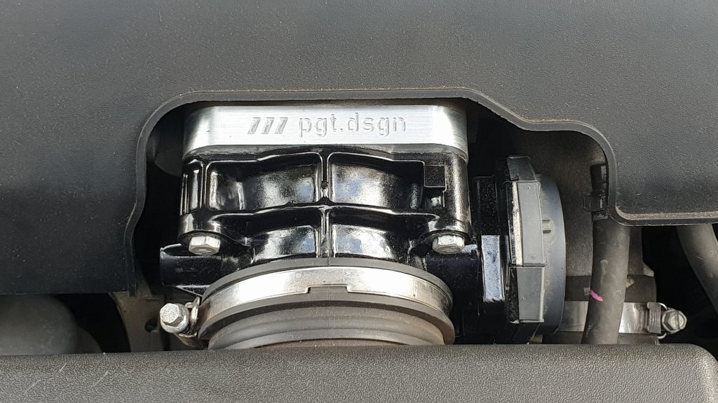
Yes, I know my engine bay needs a clean. It’s a project car, dang it!
But as you can see from this image, the tips of DIN typefaces are easy to work with an end mill of an appropriate size. You can cut down the need for needle-fine end mills and make markings in your parts that don’t scratch off, unlike those made using laser engravers.
And also, it’s just a sick looking typeface that pretty much goes with and works with anything and everything. Because of just how functional this typeface is, it’s just so gad-dang beautiful to me. I don’t know, maybe I’m a boring person. I mean, I do live in an apartment where the bulk of my furniture is grey and square… I guess I like the basis of things to be endlessly adaptable. I like this typeface that I substituted my second-favourite typeface (and the one that comes standard) on my phone for this one. Thanks for giving me that option, Samsung!
Roboto
Okay Google, I’m sad that Roboto isn’t a default Windows font. Play Despacito.
Granted to the few people who have the time or lack the inhibition to read this Blog, the mere mention of Google would put bitter tastes in their mouth about the death of a certain Google-based Social Network. However, this is one of many, many good things to come out of Google.
Roboto is the default Android system font. What’s Android? Well if you’ve been living under a rock the size of Mount Everest, Android’s the direct competitor to iOS and acts as the operating system for a good 75% of the world’s mobile phones. What Windows is to computers, Android is to phones. It can be installed on pretty much anything, and works in a pretty clever way by sandboxing each application in its own little environment with all the resources they need to operate. Applications can only talk to one-another if the user allows them to. Pretty neat right?
Well, the cool thing about Google is they stick to pretty strict and in fact, very functional design standards. Material Design is a system of designing things where it allows computers to rapidly replicate, scale and produce graphics with minimal CPU effort, and allows designers to rapidly create things like icons, interfaces and layouts with a few simple commands. As the default look and feel for Android applications, it feels and looks nice, so it helps to have a typeface that is equally as functional and clean.
Enter, Roboto! With its clean look, variety of weights and more importantly with its improvement in appearance and readability vs. its cousins, Arial and Helvetica, especially in lighter weights, it’s a typeface optimized for readability on screens. Best part is, it’s free to use and license… even in commercial products. Why? Well every man and his dog who’s learning Android Studio for the first time already uses it as the default interface for their apps, so if you intend on selling that cheapo calculator application, there you go. You’ve just used Google IP for your project!
…I guess you have to give them credit.
Bebas
B L O C K S
Okay, so… This is an interesting typeface with a bit of a neat history… And an interesting origin.
So, first of all, despite its pretty european name, it’s Japanese in origin, coming from Ryoichi Tsunekawa of Dharma Type. His inspiration is the Bauhaus movement, amongst others, which explains his huge back-catalogue of european-styled fonts that borrow from several different movements. This particular font has only just recently had lowercase letters added, and ever since its creation in 2010, it’s been the go-to title case font for many a publication…
Why? Well it’s a lot like the other fonts on this list… It bloody well goes with everything.
See, it’s a fantastic title case font because of its sheer simplicity. Pair it with a Grotesque font like Aktiv or Akzidenz to create the perfect look for your tech startup. Pair it with DIN for a nice look for your auto parts website. Pair it with a stylised font to create a contrast in appearance for a music band poster. It’s a bloody useful typeface and Tsunekawa-san’s recent update has allowed for additional weights as well as lowercase letter, which makes for a really nice title feature typeface.
Most of all, the original is free! No need to find free clones of it or give Linotype your left kidney to license it. Neat!
(although you should support Tsunekawa-san in any way you can, preferrably by downloading the typeface from Adobe Stock or heck, getting some of his other ones. They’re dang useful!)
Garamond
Ye Olde Booke Typeface… e.
So, when was the last time you’ve read a book? Well, if you’ve read Harry Potter or pretty much any other book, a good 70% of them would be typed in a Garamond-like typeface. To me it’s a typeface with a smell. I know, how can typefaces stink of anything other than printer ink? Well, when they smell like the off-gassing glue that binds paper fibers together in a yellowing book, that’s what!
Granted, it’s not the best typeface to use on a screen, but for things like wedding invitations, greeting cards, and heck back in the days when I used to work in a funeral monument company (Bleak as hell, I know), I went to this sixteenth-century baby if I ever decided that I want to tip my bowler hat or create something that is to be classically timeless… As opposed to modernistically timeless like the previous types.
Comic Sans
much font, very typeface. wow.
Okay, I can just see you all there, going off at me at how shit Comic Sans really is.
HURR HOW CAN YOU CLAIM TO BE A DESIGNER OMG WHY THE HELL AREN’T YOU USING ANIME ACE OR SOMETHING. GO BACK TO R/CRAPPYDESIGN YA DINGUS
Your stupid ass, 2021.
Well, I used to be a hipster, just like you, oh hater of one of the most interesting typefaces ever made. Comic Sans is the typeface that every designer loves to hate, mostly because it didn’t actually intend on doing what it was originally intended to do. See, Comic Sans was originally intended… for kids!
Yeah, you heard me. It’s a typeface for kids. It’s not for comics, it’s not for you to use on any form of serious signage. The second I see Comic Sans IRL, i read this typeface as if i was a primary school student… Because that’s who it’s aimed at. I specifically remember seeing a sign for a Spinal Surgeon written in Comic Sans, which outlined their services… Now is Hakase Shinonome going to be the doctor? Is his assistant a robot with a key in her back?
Okay, that’s enough Nichijou references here Beano, you gotta justify why you stan the Sans.
Well, as a person with a disability I’m all about access and inclusion. Comic Sans actually found a pretty neat purpose when it was accidentally discovered that the wide spacing, clear shapes and its uncanny hand-written and machine centric look made it both aesthetically natural to read, and comfortable enough for people with Dyslexia to be able to read it more clearly than other typefaces. The main difficulty that people who are Dyslexic face is that certain letters like d, b, p and q, may appear as if they are the wrong way around.
Enter the venerable Comic Sans and its slightly different letters!
Yes, it looked like a child literally wrote those, but if you’re a kid, learning how to read when your brain’s flipping, spinning and chopping letters off, seeing something in Comic Sans is a welcome relief, as you can tell which one of those letters is a d, a b, a p and a q.
Now granted, yes there are other typefaces out there, but here’s the other purpose that Comic Sans has… Because of the fact that you hipsters are fun as hell to trigger, especially the type who think that shit things are cool and cool things are shit, the type who unironically listen to Hack on Triple J and think that hippies wear $1000 shirts to Splendour in the Grass, it makes a sick font for memes.
That’s right, memes. If you ever, ever want to make a joke a good 10-50% funnier, make an incredibly serious statement, stick that shit in comic sans, and it’ll instantly make it better. For example?
HOW GOOD IS IT? It’s both accessible, and bloody hilarious.
Most of all, it’s a great way to determine amongst your designer friends who’s a pretentious twat and who’s a total gigachad when you’re chatting at your firm’s ping-pong table. I guarantee you, this is a cure for depression lads. If you ever feel sad with your life, go open up Illustrator, write something incredibly serious as I did above, or hell just write out the thing that makes you feel shitty, and then slap it in some 48pt Comic Sans bold, and read it back to yourself. Guaranteed better than Prozac.
…Although, I’m not a doctor here. If that doesn’t work I can’t help you. Go see a doctor. yo.
But how can any designer in their minds hate such a versatile font? It’s a joke in and of itself, due to its accidental serious use in the office and its childlike nature. It’s also really awesome for people with disabilities, and also for kids too, as it’s easier to write than cursive, but easy for a machine to read too, so OCR software doesn’t freak out with all the loopy bits. It’s a win, win, win font.
It just… Doesn’t look very good. It’s useful, and by all means handy to have, but it’s definitely not pretty. Certainly interesting though… And that’s why I like it. Fight me in the comments? Oh wait you can’t.
Beano out.